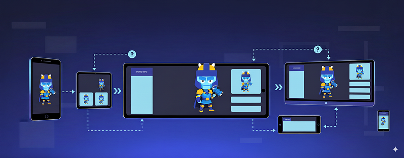
Your hero selection screen looks perfect on your mobile device. The character model sits perfectly to the right, and the UI elements are balanced on the left.
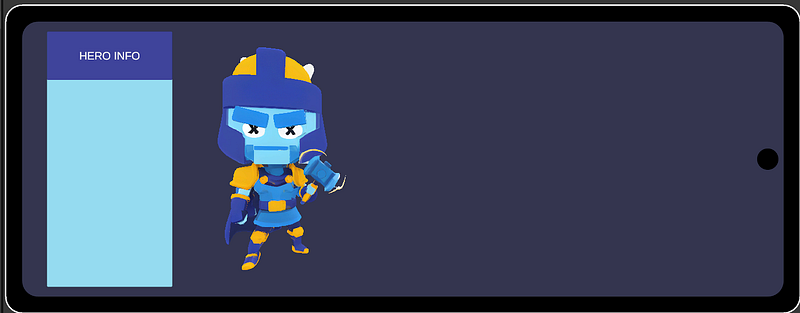
Then you test it on your tablet and suddenly your hero is floating awkwardly in space, almost off-screen. What happened?
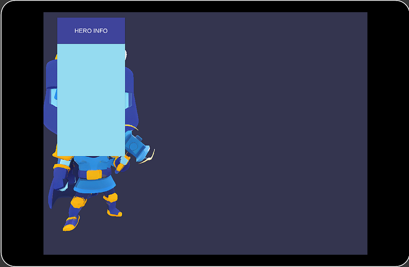
Unity’s UI system adapts to different screen sizes automatically using RectTransforms and Canvases. Your 3D content doesn’t. It lives in world space, oblivious to screen dimensions.
You’ll encounter these problems in almost every project. Device-specific positioning code, lookup tables for different aspect ratios, and magic numbers for every new device. It’s a maintenance nightmare and not scalable. On last check, Google Play Console has 17,000+ Android devices, each with countless different aspect ratios.
The root cause? Unity’s UI adapts automatically, but your 3D content doesn’t. It exists in world space, completely unaware of screen dimensions. The solution isn’t device-specific code or lookup tables, it’s one elegant mathematical concept.
Math. You might not like it, but in game development, math is your friend. And good news, since you’re probably not writing a graphics engine from scratch, a lot of it isn’t as difficult as you’d think.
In our case, we need just one simple formula: the remap function.
The Remap Function
public static float RemapBetweenRange(float x, float a, float b, float c, float d)
{
    return (x - a) / (b - a) * (d - c) + c;
}
This maps any valuexfrom range[a, b]to the equivalent position in range[c, d].
If you’ve used Shader Graph, you’ll recognize this, it’s the same as the Remap Node. Unity recognizes that this function is useful enough to warrant its own node.
A simple use case for this would be converting temperature from Celsius [0, 100] to Fahrenheit [32, 212].
float fahrenheit = RemapBetweenRange(25, 0, 100, 32, 212); // Returns 77°FHere’s how it works visually:
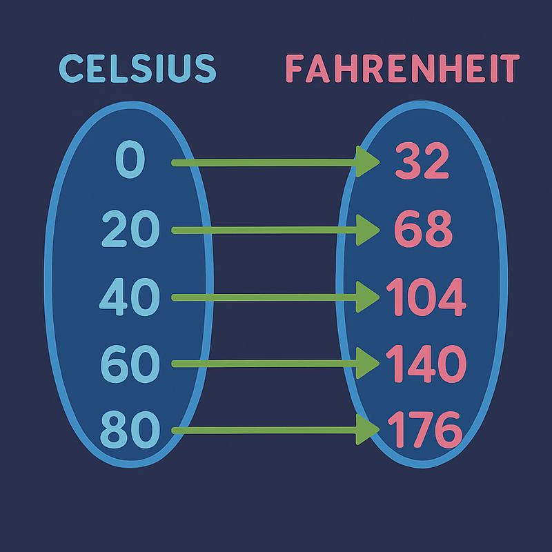
That's all you have to do, and you can instantly know how to convert the two.
How does it solve our problem?
We can treat aspect ratio as one range, and position/rotation/scale as another range. Here’s how we implement it:
[ExecuteInEditMode]
public class AspectRatioFitter : MonoBehaviour
{
    [Header("Position Settings")]
    [SerializeField] private Vector3 minAspectRatioPosition;
    [SerializeField] private Vector3 maxAspectRatioPosition;

    [Header("Rotation Settings")]
    [SerializeField] private Vector3 minAspectRatioRotation;
    [SerializeField] private Vector3 maxAspectRatioRotation;

    [Header("Scale Settings")]
    [SerializeField] private Vector3 minAspectRatioScale = Vector3.one;
    [SerializeField] private Vector3 maxAspectRatioScale = Vector3.one;

    [Header("Aspect Ratio Range")]
    [SerializeField] private float minAspectRatio = 0.36f;  // (tall phones)
    [SerializeField] private float maxAspectRatio = 0.75f;  // (tablets)

    // Note: Using height/width for standard aspect ratio notation
    private float AspectRatio => (float)Screen.height / Screen.width;

    private void Start()
    {
        UpdateTransform();
    }


    private void UpdateTransform()
    {
        float currentAspectRatio = AspectRatio;

        transform.position = RemapVector3(currentAspectRatio, minAspectRatioPosition, maxAspectRatioPosition);
        transform.rotation = Quaternion.Euler(RemapVector3(currentAspectRatio, minAspectRatioRotation, maxAspectRatioRotation));
        transform.localScale = RemapVector3(currentAspectRatio, minAspectRatioScale, maxAspectRatioScale);
    }

    private Vector3 RemapVector3(float aspectRatio, Vector3 minValues, Vector3 maxValues)
    {
        return new Vector3(
            RemapValue(aspectRatio, minAspectRatio, maxAspectRatio, minValues.x, maxValues.x),
            RemapValue(aspectRatio, minAspectRatio, maxAspectRatio, minValues.y, maxValues.y),
            RemapValue(aspectRatio, minAspectRatio, maxAspectRatio, minValues.z, maxValues.z)
        );
    }

    private static float RemapValue(float value, float fromMin, float fromMax, float toMin, float toMax)
    {
        return (value - fromMin) / (fromMax - fromMin) * (toMax - toMin) + toMin;
    }

    public static float RemapBetweenRange(float x, float a, float b, float c, float d)
    {
        return (x - a) / (b - a) * (d - c) + c;
    }

#if UNITY_EDITOR
    private void Update()
    {
        UpdateTransform();
    }
#endif
}
Now, after using this, we can configure the hero to stay properly framed on any device. Because we mapped a range, this works seamlessly across all aspect ratios without any additional code.
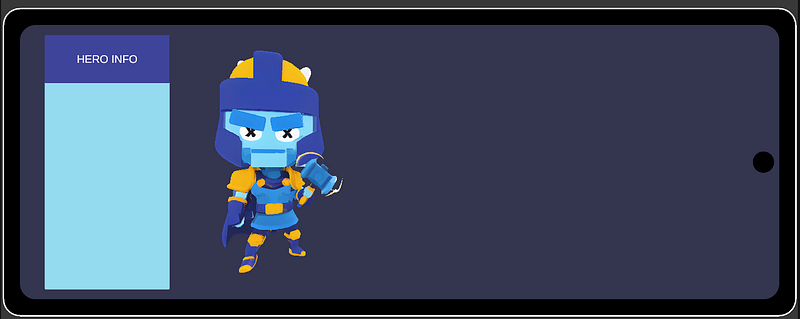
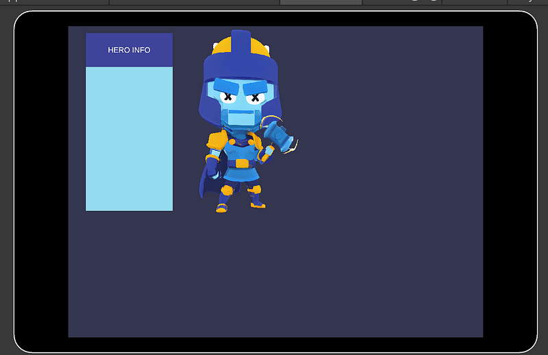
The Result
With this approach, your 3D elements adapt smoothly across all screen sizes. The hero that looked perfect on one device now looks equally perfect on others, tablets, iPhones, and everything in between. The beauty of this solution is its scalability. Instead of maintaining separate positioning logic for different devices, you define the extremes once and let the math handle everything in between. Add a new device with an unusual aspect ratio? It just works. This isn’t a magic bullet, but it's a good tool to have at your belt.